
Scaling Your Vue Components for Mid-Large Size Apps
One of the key pieces in scaling your Vue app is having good component architecture.
- How are components named?
- What folder hierarchy should you use?
- How is component code scoped?
The cost of not having clear answers to these simple questions increases as your app grows.
My previous role was the tech lead at a startup. Growing pains were frequent with pivots, design changes and new features. All pushing our total component count up.
My below suggestions are what I came up with to solve our scaling issues. Your project will have its own requirements.
100+ component club
Let's assume once you hit 100+ components, then you are a mid-size app and you will be feeling your own growing pains.
Are you in the club? Run the following in your component folder:
# cd app/components
COMPONENTS=$(ls -lR **/*.vue | wc -l) && echo -e "You have ${COMPONENTS} components."
Problems you may have
- Difficult to remember which component to use where
- Code is being repeated
- Monolithic components
- New components are being built instead of leveraging existing ones
- Inconsistent emits and props between components with the same functionality
- Technical debt is being ignored because it is too painful
Solving component scaling with rules
Good code adheres to a set of rules. You either follow existing rules (syntax and conventions) or create new ones and make sure others follow them (documentation and code reviews).
Rule 0. Have good dev processes
There is no substitute for a good development process. You need to be following best continuous delivery, documentation and communication practices. The rest of the rules will not help you if you are not functioning like a well-oiled machine.
Rule 1. Know the style guide
You should be familiar with the official Vue.js Style Guide. It gives you clear, concise instructions on what you should and shouldn't do. You should set up eslint-plugin-vue with the recommended rules.
module.exports = {
  extends: [
    // ...
    'plugin:vue/vue3-recommended',
    // 'plugin:vue/recommended' // Use this if you are using Vue.js 2.x.
  ],
}
Rule 2. Use a component naming convention
The bane of developers lives: how to name something.
You can address that by having an easy-to-follow convention on how to name a component. The convention also tells you where to put the component in your folder hierarchy.
Prefix
Base components (a.k.a. presentational, dumb, or pure components) that apply app-specific styling and conventions should all begin with a specific prefix, such as Base, App, or V.
A short prefix for all your components is preferable to the above.
Using a prefix avoids conflicts with HTML tags and third-party components. It also gives you scoped IDE autocompletion and more reusable components.
Prefixing becomes especially important when working with a component library (Vuetify, VueStrap, etc) or third-party components (algolia, google maps, etc).
You should use something which relates to your app, for example, I use h as the prefix because my site is harlanzw.com.
<template>
  <p>Please enter your email to subscribe</p>
  <!-- Vuetify components use a V prefix -->
  <v-text-field label="Your Email" />
  <!-- H is the prefix for my apps components -->
  <h-button>Submit</h-button>
</template>
You can use many prefixes for your components to help you with scoping code.
<template>
  <!-- 'the' as a prefix for layout components -->
  <the-header>
    <!-- 'v' prefix for vuetify components -->
    <v-img src="logo.png" />
    <!-- 'h' prefix for our branded components -->
    <h-button>Sign In</h-button>
  </the-header>
  <main>
    <the-sidebar />
    <the-content v-html="content" />
  </main>
  <the-footer />
</template>
Namespace
Child components that are tightly coupled with their parent should include the parent component name as a prefix.
The style guide recommends starting the component name with the parent component. I've found using a namespace after the prefix instead is more flexible.
Namespaces avoid conflicts, improve IDE autocompletion and define the scope of the component.
You should map namespaces to a folder, this way you can group components, making them easier to find and use.
An example of a namespace is Field, for all our field components (text field, textarea, search, etc.).
components/
|- Field/ # namespace
|--- HFieldText.vue
|--- HFieldTextarea.vue
|--- HFieldSearch.vue
|--- HFieldAutocomplete.vue
|--- HFieldCheckbox.vue
You can then create conventions that components in a namespace should follow. For example these components should all have a :value prop and $emit('input', value).
Class (optional)
Component names should start with the highest-level (often most general) words and end with descriptive modifying words.
The final part of the convention is, in fact, the name of the component. Thinking of it as a class name makes the distinction between the namespace easier. You still want to follow the above style guide rule, our class names should be general to descriptive.
The class should be optional. Namespaces can provide a default component to reduce the name of common components.
Imagine you have a project with a few buttons. Most of the time you want to use the default button, you shouldn't
need to name it HButtonDefault.vue.
components/
|- Button/ # namespace
|--- HButton.vue # The namespaces default component
|--- HButtonCallToAction.vue # A call to action button
|--- HButtonSubmitForm.vue # A button to submit forms
Recommendations on naming the class:
- Describe the application function of the component, rather than what it looks like.
- ❌
HButtonRainbowFlashing.vue - ✅
HButtonCallToAction.vue
- ❌
- Choose to be verbose if it adds clarity to the scope.
- ❌
HProfileUser.vue - ✅
HProfileAuthenticatedUsersCard.vue
- ❌
- Prefer full words over abbreviations. From the style guide.
Rule 3. Separate component scopes
Defining scopes for how components behave will guide you in staying DRY.
There are many ways to set this up. A good starting point is a scope for "shared" (a.k.a. base, presentational or dumb) components and "app" (a.k.a single-instance).
components/
|- app # Contains application logic
|- shared # Does not contain application logic
You could also pull out your "shared" components into their own npm package.
When creating new components it's natural to couple application logic in. With this setup, you'll think about component scopes more and how code can be re-used.
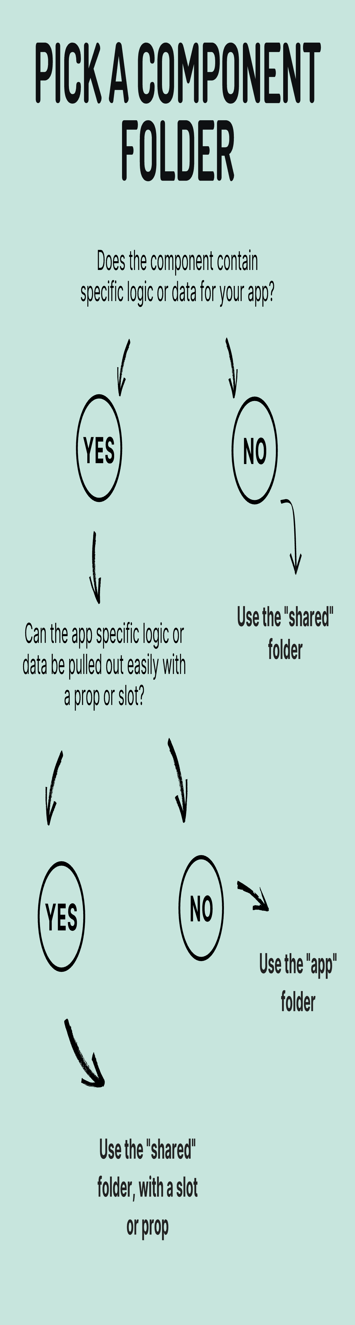
"Shared" Folder - Base Components
These components are re-usable and include form inputs, buttons, dialogues and modals. They should never contain application logic or state data.
You should be aiming to build your own "UI kit" from these components.
Copy-pasting your shared folder into a new project should work out of the box (assuming you handle dependencies).
"App" Folder - App components
App components do contain application logic and state data.
If you were to copy+paste an app component into a new project, it should not work.
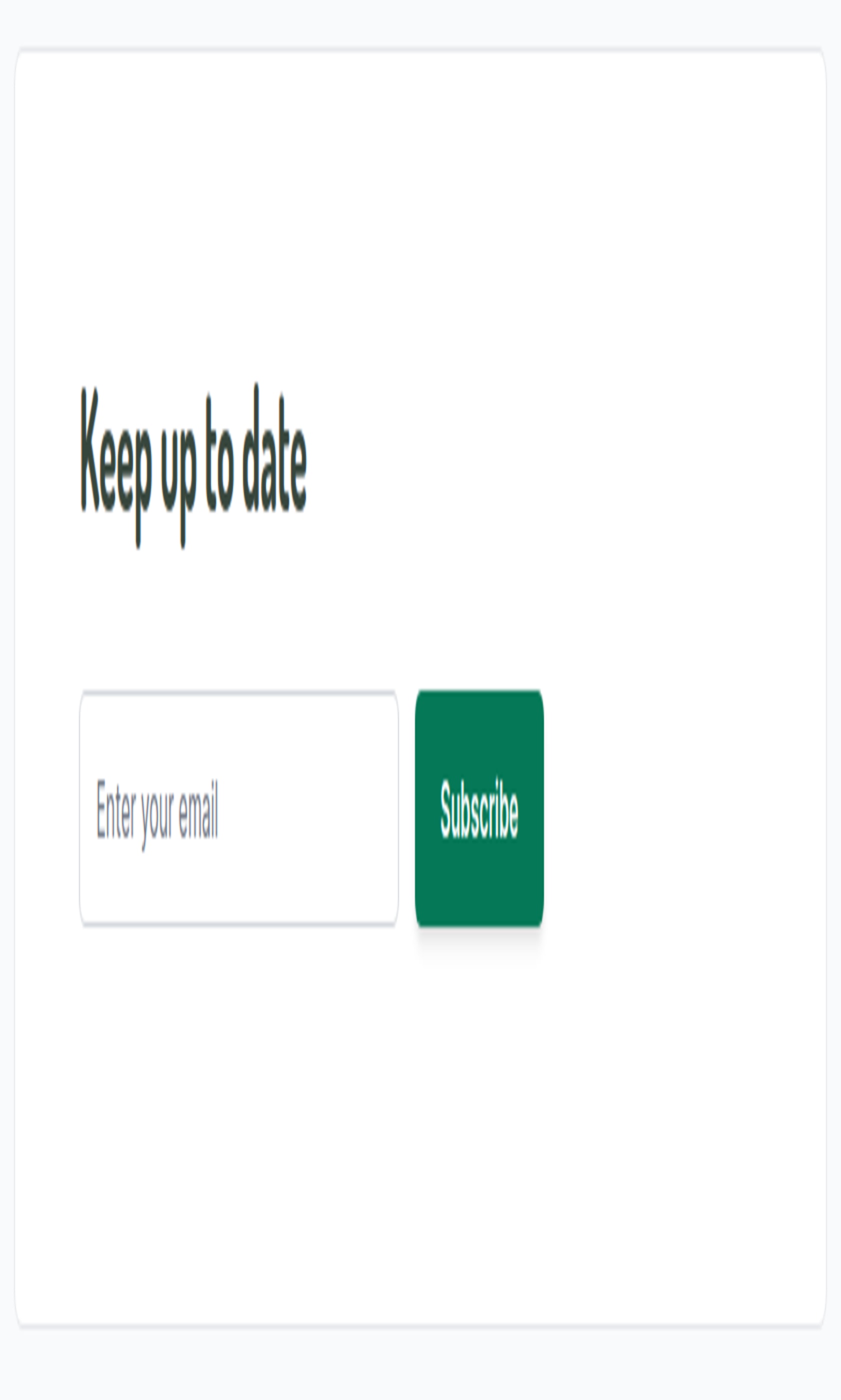
Example: Newsletter Sign Up
This exists as two "app" components, they contain logic for validation and posting to an API. They both contain "shared" components.
components/
# application component scope
|- app/
|-- Newsletter # namespace
|--- HNewsletterForm.vue # validates and posts data
|--- HNewsletterCard.vue # handles successful form post
# shared component scope
|- shared/
|-- Alert/
|--- HAlertSuccess.vue
|-- Button/
|--- HButton.vue
|-- Card/
|--- HCard.vue
|-- Form
|--- HForm.vue
|-- Field/
|--- HFieldEmail.vue
<template>
  <h-form @submit="submit">
    <h-field-email
      v-model="email"
      label="Enter your email"
    />
    <h-button type="submit">
      Subscribe
    </h-button>
  </h-form>
</template>
<template>
  <h-card>
    <div class="pl-3">
      <h2>Keep up to date</h2>
      <h-newsletter-form
        v-if="!success"
        @submit="success = true"
      />
      <h-alert-success
        v-else
      >
        Thanks for signing up :)
      </h-alert-success>
    </div>
  </h-card>
</template>
Example: Forum Thread
Now imagine you want to build a forum thread page. A user can see comments, upvote comments and post their own comment.
Using F as our component prefix, let's look at what you need.
components/
# application component scope
|- app/
|-- Thread # namespace
|--- FThread.vue # Wraps the entire thread
|--- FThreadPost.vue # A single post / reply
|--- FThreadFormReply.vue # Form to submit a reply
|-- Field/
|--- FFieldComment.vue # Comment box for posts
|-- Button/
|--- FButtonUpvote.vue # The thumbs up button
# shared component scope
|- shared/
|-- Img/
|--- FImgAvatar.vue # Users photos
|-- Field/
|--- FFieldWYSIWYG.vue # Comment box for posts
|-- Card/
|--- FCard.vue # Gives posts a 'card' look
|-- Button/
|--- FButton.vue # Reply button for the post box
<template>
  <f-thread-post
    v-for="posts as post"
    :key="post.id"
    :post="post"
  />
  <f-thread-reply @submit="addPost" />
</template>
<template>
  <f-card>
    <div class="p-3 border-b-2 border-gray-500 flex">
      <f-img-avatar :src="post.author.avatar" />
      <span>{{ post.author.name }}</span>
      <span>{{ post.publishedAgo }}</span>
    </div>
    <div class="p-3 border-b-2 border-gray-500 prose" v-html="post.content" />
    <div class="p-3">
      <f-button-upvote
        :upvotes="post.upvotes"
        class="border-r-2 border-gray-500 pr-3"
        @click="upvote"
      />
    </div>
  </f-card>
</template>
<template>
  <f-form @submit="submitComment">
    <f-field-comment
      label="Write a reply"
    />
    <div class="flex">
      <p>Please make sure you've read our Forum Rules before replying.</p>
      <f-button type="submit">
        Reply
      </f-button>
    </div>
  </f-form>
</template>
Extra and optional rules
Use An Automatic Component Importer
Being tied to import paths once you have a few hundred components is going to slow you down.
Using an automatic component imports will clean up your code. You'll be free to tinker with the directory structure of your components in any way you want.
Typescript Components
The value of types, when you're working with objects is too good to pass up. Will save you hours down the line in developer experience. As a starting point, I'd try and get your shared components using Typescript.
<script lang="ts">
import type { PropType } from 'vue'
import { defineComponent } from 'vue'
import type { Post } from './types'

export default defineComponent({
  props: {
    post: {
      type: Object as PropType<Post>,
      required: true
    }
  },
})
</script>
Components have "one job"
Every component should have one job, any code in the component that isn't achieving that job shouldn't be there.
You should be thinking when you create a component what it's one core function is.
You can limit yourself with this mindset, but it's worth keeping in mind as you go.
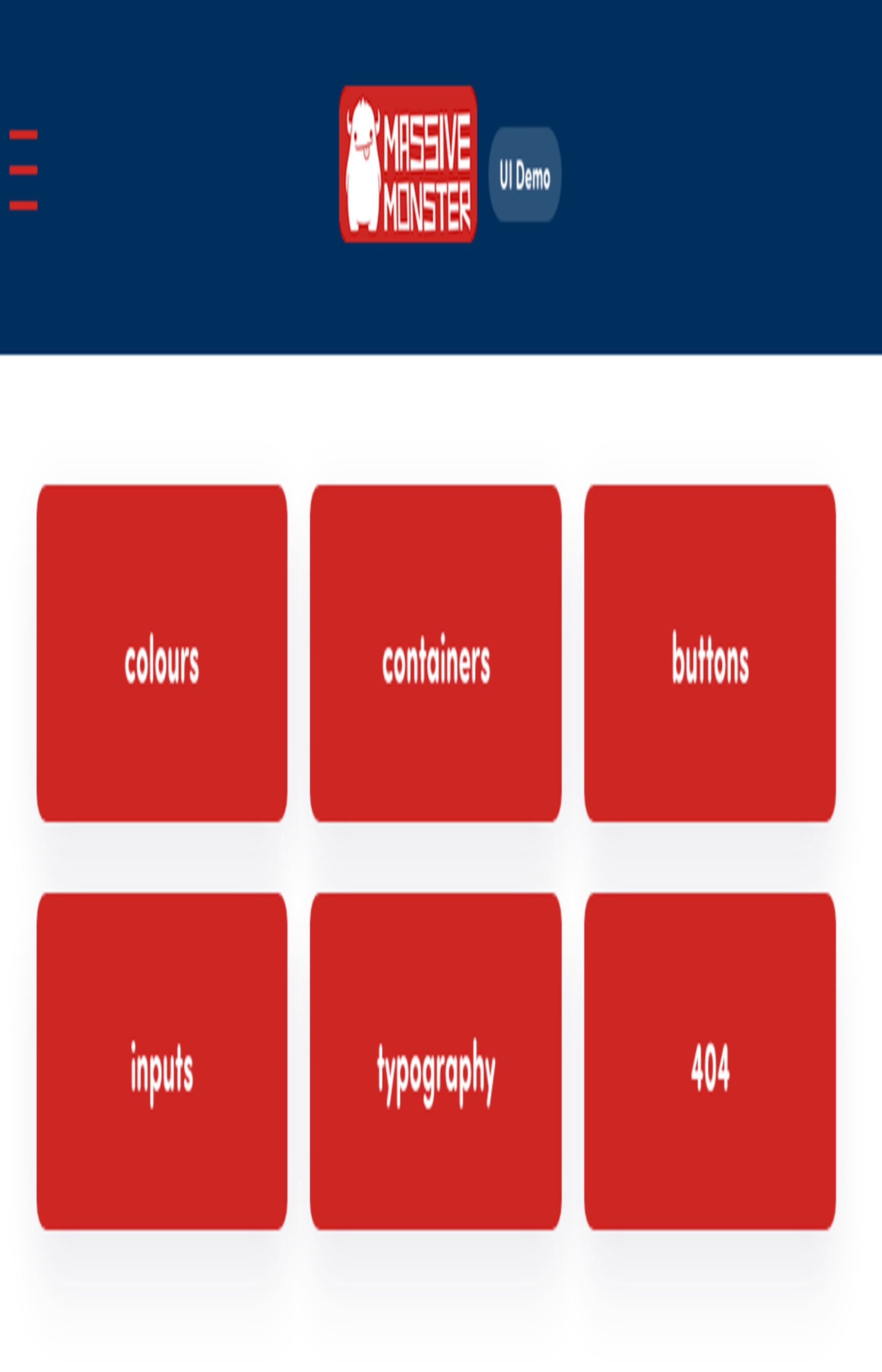
Create component demo pages
Using a package like Storybook is a great idea, but it comes with overhead and when you're starting out it can be a bit overkill.
As a starting point, you can create pages under a /demo prefix and throw your components on it.
You want an easy way to find components and classes that are available.
Here is a rough demo page as an example: Massive Monster UI Demo. Keep it as basic as you want.
Mixins and composables
This one should be pretty obvious and there are enough articles elsewhere on using these.
You want to pull out common logic from components and put them in either mixins or composables.
Check out VueUse for some ideas on what that could look like.
Thanks for reading
If you like the technical side of Vue and Laravel, I'll be posting regular articles on this site. The best way to keep up to date is by following me @harlan_zw or signing up for the newsletter below.